30 December 2009

The magnificent 7 and equity markets - Review 5 (end of the year)

We are now 10 month up after the trough reached on 9th March 2009. Following extremely oversold conditions in March, the marked forged ahead with a vengeance the MSCI World Free index having surged 76% (less in the Western world and more in the developing world). The magnificent 7 are telling us that there is no reason for the markets to pause beyond short term overstretched valuations (I recommend the reader to go to the GTI web site for their monthly newsletter, one of the best available).


S&P 500 Banks index: For 5 month the index has traded in a narrow 120-140 band. The index and the 200 days moving average are converging after the latter turned up in July and is now positive. The index is still 70% below the nadir reached in February 2007. The 120 support is holding very well. Positive.


Global 1200 financial index
: The world financial sector broke multiplied its value 2.5 times since it trough in March this year, to trade between 930-1040 since July. As for the S&P Banks index the 200 days moving average turned positive and is converging with the index. Positive.


TED spread (LIBOR USD 3 mth - US 3 mth T-bills): The spread is back to normal - no stress showing at +/- 20 basis points (0.20%). The interbank market shows no stress. Positive.


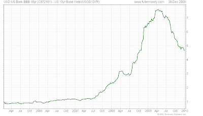
USD bank BBB 10 yr - US 10 yr yield
: Whilst still high and above historical average, the spread has steadily decreased since July and is nearly 3% below the highest point reached in March standing at 4.5%. Positive.


OEX volatility: OEX volatility has continued it downward trend and is now hovering around 20% well below the stress times of Q4 2008 and Q1 2009, and at the level I wanted to see during my lats review in October. We need this indicator to stay at or below 20%. Positive.


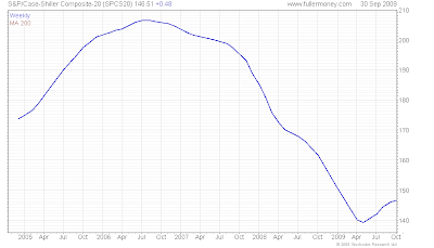
S&P Case Shiller house price index: The latest data (October) published 29th December (see my comment yesterday) showed a picture at best flat, stopping a series of solid gains. There is a clear dichotomy appearing between existing homes where the market improves and new homes that is still very weak.

Composite-10: October 2009: +0.01%, y/y: -6,4%
Composite-20: October 2009: -0.05%, y/y: -7,3%

Signs are becoming more positive but still ambivalent. Slightly positive.


Oil price
: The oil prices seems to be capped at +/- $80/b. Higher oil prices can be absorbed by economies it if the pace of increase is not sharp. For example, the doubing of prices since the low reached in March has not impaired the "recovery". If the economy gains impetus things may however look different however: beware of a sudden and sharp rally. Positive for the time being.


Conclusion: All these indicators are positive. I have been dead wrong to get out of equity markets in July but jeopardizing 20-25% gain between early April and late June for a possible 15% additional profit did not appeal to me. I still believe that there are strong headwinds ahead: unemployment not going down as fast as wished (and its psychological effect on consumers), the private sector unable to take the relay from the public sector leading to a second package in the US (and as a slump in the USD as collateral damage), additional delinquencies on residential, commercial and credit cards damaging the recovering (but still weak) bank's balance sheets, etc.

I am not (yet) in the camp of the commentators that see the current rally being a bear market rally. Liquidity is still huge and on the sideline: this should continue to spur equity markets. I however expect a 20-25% correction in equity markets by 2010 H1 but a real and fundamental improvement in company results.

29 December 2009

US housing market: still mixed signals

According to data released by the US Census Bureau on 23rd December, New home sales dropped by 11.3 per cent in November to an adjusted annual rate of 355,000. That was the lowest level in seven months. The good number for existing home sales last month seem to have cannibalized new home sales, as well as the tax break extension into next year announced by the Obama Administration.

The Case-Shiller 20 index published by Standard & Poor's today shows that home prices were flat and failed to keep pace with gains so far in 2009. The figures are not seasonally adjusted (+0.4% seasonally adjusted – the fifth straight improvement). In the past year, prices are down 7.3% in the 20 cities.

These numbers are not showing the beginning of a double dip in the housing market as yet. I will, however watch them very carefully in the coming month.


Source:

U.S. Census Bureau: New Residential Sales in November 2009
http://www.census.gov/const/www/newressalesindex.html

Financial Times: Sales of new US homes plunge unexpectedly
http://www.ft.com/cms/s/0/cdad284a-efce-11de-833d-00144feab49a.html?nclick_check=1

Standard & Poor’s: S&P/Case-Shiller Home Price Indices - October 2009

http://www.standardandpoors.com/indices/sp-case-shiller-home-price-indices/en/us/?indexId=spusa-cashpidff--p-us----type&blobwhere=1245200590760&blobheadervalue3=abinary%3B+charset%3DUTF-8&blobnocache=true

The New York Times: Slight Rise in Home Prices Masks Signs of Weakness
http://www.nytimes.com/2009/12/30/business/economy/30econ.html?_r=1&ref=business

28 December 2009

How much money did the US Government commit during the financial crisis to date?

Here is a diagram that summarizes the current state of the US commitment to avail the current financial crisis: $7.8 trillion and counting...


Source:

The Washington Post
http://www.washingtonpost.com/wp-dyn/content/graphic/2009/02/11/GR2009021101150.html

27 December 2009

Governement debt: a huge Ponzi scheme?

Since Central Banks wide-open an endless flow of money, I have warned about the next bubble to implode, “The Mother of all Bubbles”: Government debt.

Eric Sprott & David Franklin, of Sprott Asset Management from Canada, recently wrote a paper on where the huge amount of new debt issued by the US Treasury went: “Is it all just a Ponzi scheme?

I found their findings particularly interesting (emphasis mine):
In the latest Treasury Bulletin published in December 2009, ownership data reveals that the United States increased the public debt by $1.885 trillion dollars in fiscal 2009. So who bought all the new Treasury securities to finance the massive increase in expenditures?

So to summarize, the majority buyers of Treasury securities in 2009 were:

1. Foreign and International buyers who purchased $697.5 billion. (+23% from FY 2008)
2. The Federal Reserve who bought $286 billion. (+60% from FY 2008)
3. The Household Sector who bought $528 billion to Q3 – which puts them on track to
purchase $704 billion for fiscal 2009.- (+35x (!!) from FY 2008)

In fact the third group is labeled as “others”, but, after careful analysis, Sprott discovered that most of this group represented the “Household Sector” (and this is outside of Money Market Funds, Mutual Funds, ETF’s, Life Insurance Companies, Pension and Retirement funds and Closed-End Funds, which are all separate reporting categories).
Who could believe that Households could have increased their 35 times in a year after the crisis we went through? So, our Sprott friends went a bit further and their discovery is somewhat scary:
So to answer the question - who is the Household Sector? They are a PHANTOM. They don’t exist. They merely serve to balance the ledger in the Federal Reserve’s Flow of Funds Report.
Already PIMCO’s co-chief investment - Bill Gross, the world most powerful bond investor – is advising to front run Government debt and and boosted cash to the highest level since 2008.

Zhu Min, deputy governor of the People’s Bank of China, alongside other foreign holders, also expressed concern over new Treasury purchases. He went on to say, “The United States cannot force foreign governments to increase their holdings of Treasuries… Double the holdings? It is definitely impossible.”
If the foreign support wanes in 2010, the US will require significant domestic support to fund future debt issuance, which is far from assured if we refer to Mr. Gross’s recent comment.
Sprott concludes:
The fact that the Federal Reserve and US Treasury cannot identify the second largest buyer of treasury securities this year proves that the traditional buyers are not keeping pace with the US government’s deficit spending. It makes us wonder if it’s all just a Ponzi scheme.
Me too... Don't be long Government debt.

Source:

Sprott Asset Manangement: "Is is all just a Ponzi Scheme?"-Markets at a glance December 2009
http://www.sprott.com/Default.aspx?uType=can

Business Week: Pimco's Gross Boosts Cash to Most Since Lehman Failed
http://www.businessweek.com/investor/content/dec2009/pi20091217_105749.htm

Shanghai Daily: Harder to buy US Treasuries
http://www.shanghaidaily.com/sp/article/2009/200912/20091218/article_423054.htm

Federal Reserve: Flow of Funds Accounts of the United States - Q3 2009

http://www.federalreserve.gov/releases/z1/Current/z1.pdf

25 December 2009

Christmas, Insurers and Obama's health bill

BRICs Dominating World Economy: O'Neill

An insigth from Goldman's O'Neil on BRICs for 2010. This goes along my long term investment themes


17 December 2009

A virtual interview with the WSJ and the FT - Part 5 (end)

FT: Regarding asset allocation, it seems that you disregard all studies that advocate a balanced portfolio and diversification: could you elaborate?

M&B: One should not make a confusion between balanced and diversification. A balanced portfolio has no signification per se; what matters is to build a portfolio with respect to each investor's objective and risk tolerance -and often they contradict each other- hence, beyond well understanding the objectives and risks, the need to educate clients.

To me, a balanced portfolio is a mix bag and a way to dilute responsibility: it is more marketing than anything else and make sure you are within the industry average. I do not consider I am paid to be balanced but to have opinions (strong ones more often than not!) that are the result of a longstanding experience and deep analysis. If I am not balanced, I however diversify investments, not only because of the themes my Partners and I at P&C Global Wealth Managers are absolutely convinced are secular trends but because it is common sense: no fund manager can be good on all instruments on all markets. Many empirical studies show that portfolio performance results from a very large part from asset allocation (some studies concluded 90% of the performance), stock picking representing the balance: I focus on asset allocation and timing (to some extent - one never can be exactly and always right on timing) and leave the stock picking to specialists, particularly for mid and small cap companies (Remember, we may be 100% cash is warranted - and it served my clients very well in July 2008!. Here a slide that we include in some of our presentation and perfectly illustrate this:

We put the team together, but we leave each specialist competing to be first in his category.

My investments are centered around 8 themes:
  • Energy and alternatives
  • Supply inelasticity
  • Aging population
  • Emerging middle-class in developing economies
  • Global outsourcing
  • Emerging China
  • Water shortages & ecology
  • Japan restructuring
You will take notice that beyond Japan (located nearby the world fastest growing zone economically and still an innovation powerhouse, despite it long term problem that is its aging and diminishing population - this can be reversed however- and record debt/GDP ratio), no Western country is included. However, Supply inelasticity and Energy are also plays on Canada and Australia for example.

WSJ: Many of your themes are redundant however

M&B: Yes, and why not? True the emerging middle-class implies more energy and commodities consumption but also excellent opportunities in retailing for example. And whilst there is no Western country/zone that is included in my themes, many companies based in these countries are investment vehicle (water treatment or energy for example); but it does not make any sense to invest in France, Europe or the US as a theme (I have already discussed this on this blog at length).

I wrote several time that the shift of power towards Asia is in motion and quick motion, despite all the imperfections in these countries that need to be addressed and changes that are required for a generational growth and success.

Going back to the first question I would link my answer to the current financial, political and economic crises (and soon social one): There is a huge difference between developing a business where you have a share ownership and being an employee judged on the annual (quarterly?) performance: in one case your interest is to develop a long term viable business, in the other your next bonus; this is human nature and can work in the short term. It is worth revisiting the agency theory; it would explain a lot about the evolution of capitalism during the last 20 years.

WSJ: This concludes our first round of interviews; thank you for your insight

FT
: This was somewhat refreshing and quite different from the mainstream: thank you.

M&B: Thank you to both of you, to have allowed me to express some of my thoughts. One last word: we are living in Historical times and the forthcoming few years will shape the world for at least a century. If I have one wish, it is that the quality of Western policy makers dramatically improve for the sake of our children, grand-children and great grand-children since, as Chruchill said once, democracy is the worst system after all the other ones.

07 December 2009

Chart of the Day -US Unemployment

Last week, the Labor Department reported that non-farm payrolls (jobs) decreased by 11,000 in November - the smallest decline since the recession began at the close of 2007. Temp-agency employment surged 52.4 k in November, the largest surge for 5 years; this metric is a quite reliable forward-looking indicator. These number are definitely positive but let's wait their confirmation in December and if they are not just part-time employees hired for the season's shopping.

Today's chart puts that decline into perspective by comparing job losses during the current economic recession (solid red line) to that of the last recession (dashed gold line) and the average recession from 1950-2006 (dashed blue line). As today's chart illustrates, the current job market has suffered losses that are more than triple as much as what occurs at the lows of the average recession/job loss cycle.


Sources:

Chart of the Day
http://www.chartoftheday.com/20091204.htm?T

Bureau of Labor Statistics

http://www.bls.gov/news.release/pdf/empsit.pdf